
Almost everyone I talk to before they start in investment banking has some version of the same fear: that they aren't smart enough, that the learning curve is too steep, that everyone else already knows how to build this stuff and they'll be exposed. I had that fear too. I remember looking at real banker decks before I started and being genuinely intimidated by how polished and professional they looked, wondering how anyone builds that from scratch under time pressure.
The short version
The honest answer, from someone who has now been on the other side of it: a real board deck is mostly formatting, math a strong high schooler could follow, and someone senior telling you what to build. You are almost never starting from a blank page. You are almost never inventing the analysis yourself. The genuine skill takes time to build, but it is not the skill people are afraid of, and most people who quit don't quit because they weren't smart enough.
The fear, and why it is aimed at the wrong thing
Senior analysts and associates will tell you the same thing I'm about to: you understand this. But you will still get thrown into the fire very quickly, and that combination, understanding the concepts while being handed real deadlines on real live deals within your first weeks, is what actually produces the fear. It isn't that the material is beyond you. It's that nobody warns you how much of the job is speed and structure rather than raw intelligence.
I want to walk through an actual deck to show you exactly what I mean, page by page, because seeing it is more convincing than being told it.
A real deck, page by page, deconstructed
The pages below are the actual slides from a real Bank of America Merrill Lynch board presentation, filed publicly as an exhibit to the target's Schedule 13E-3, built for a real estate investment trust special committee during a going-private negotiation, the same deal covered in our Rouse/Brookfield REIT breakdown. What matters for this piece isn't the deal itself, it's what each page actually required to build, because that's the part nobody shows you before you start.
The market update page: pure formatting
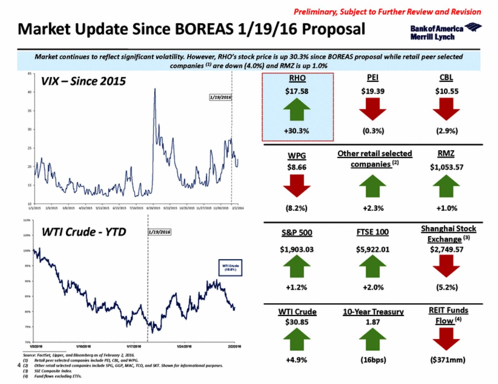
This page is a "Market Update" slide: a VIX chart since 2015, a WTI crude chart year-to-date, and a grid of up/down arrows showing how the target's stock, its peers, the S&P 500, the FTSE, the 10-year Treasury, and REIT fund flows have all moved since the bid was announced. It looks dense and professional. It is two charts pulled straight from Bloomberg or FactSet and a grid of arrows built off numbers that already exist in a market data terminal. There is no modeling on this page at all. It is formatting, and it is exactly the kind of page a first-week analyst gets handed to update daily.
The trading overview: pull data, plot it
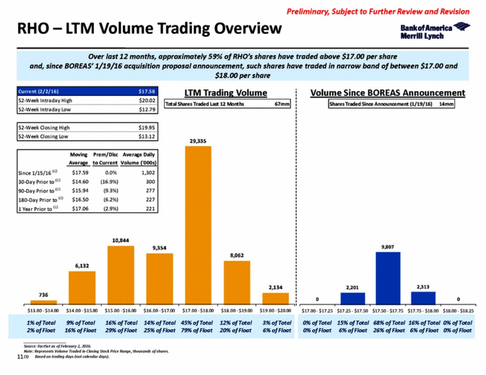
This page shows the target's 52-week high and low, its trading volume distribution by price band, and how much volume has traded since the deal was announced. Every number on that page comes out of FactSet with a date filter applied. Building the bar chart of "shares traded by price range" is a pivot table, not an analysis. This is the kind of page that looks impressive stacked next to text describing what it means, but the underlying work is mechanical.
The projections summary: math, not modeling
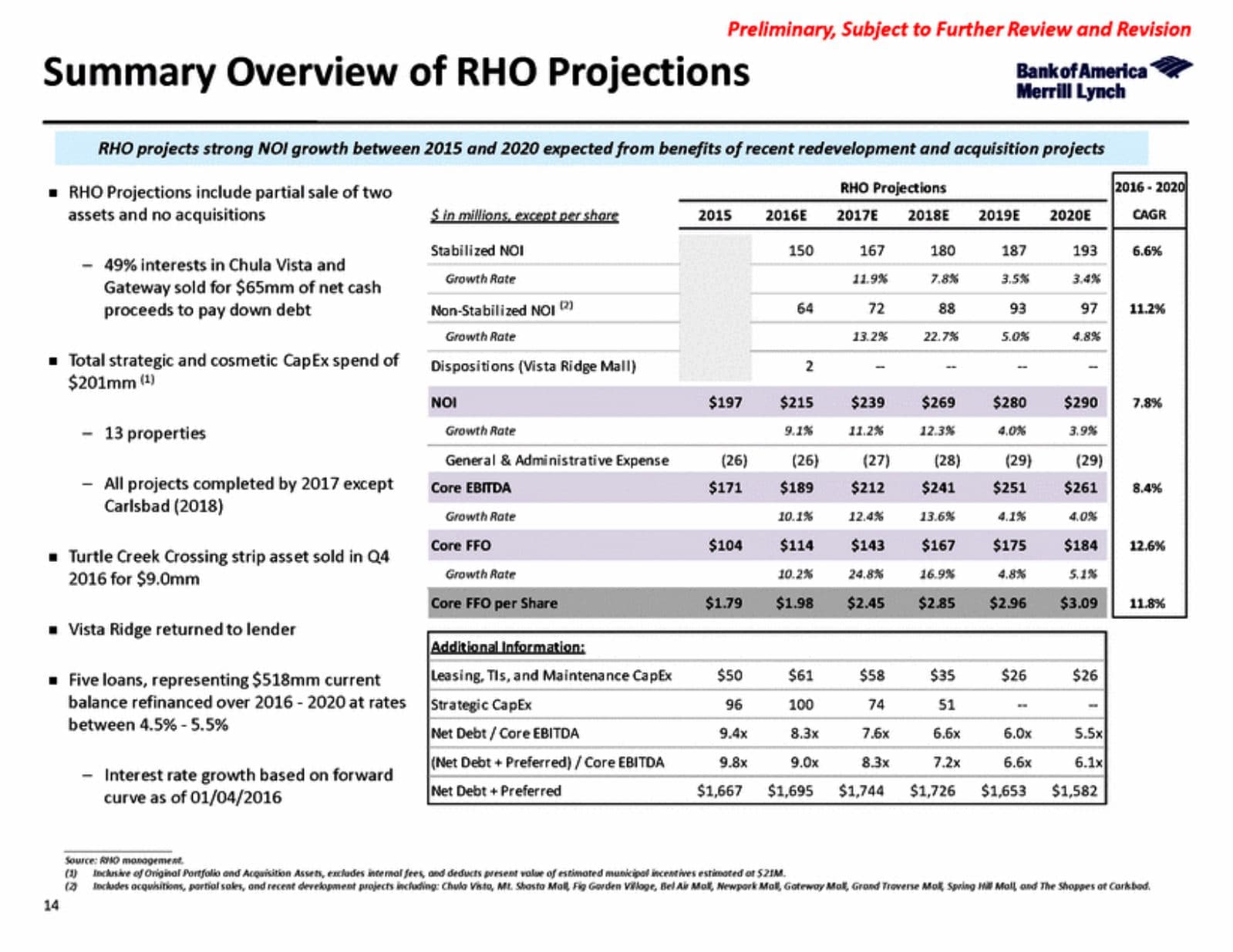
This is the page people are most afraid of before they start, a multi-year table of NOI, EBITDA, and FFO projections with growth rates and CAGRs calculated out. It looks like "modeling." It is, in the sense that a model produced these numbers, but the actual projections almost always come from management or from a VP or associate who has already decided the assumptions. Your job as the analyst is frequently just the arithmetic: this year's number divided by last year's number, minus one, equals the growth rate. That's a formula, not a judgment call. The real modeling decision, what growth rate is reasonable, what the company should assume about redevelopment timing, gets made above you, and you're executing math a strong high schooler could follow once someone hands you the inputs.
The football field: stack six outputs on one page
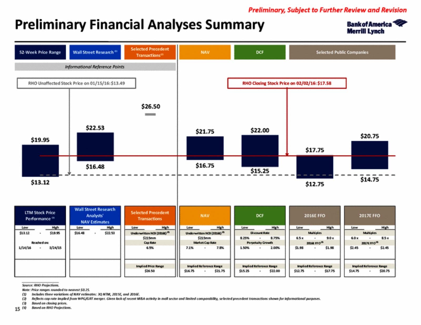
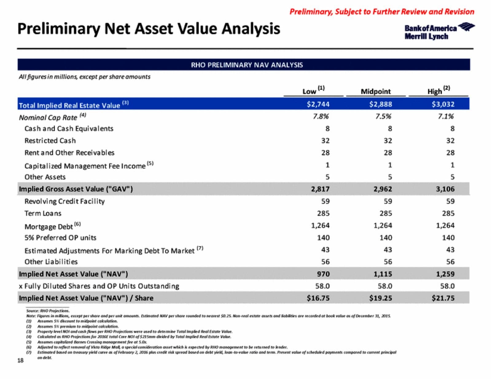
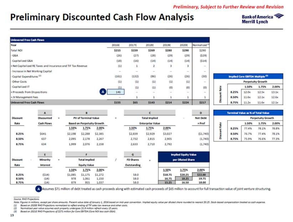
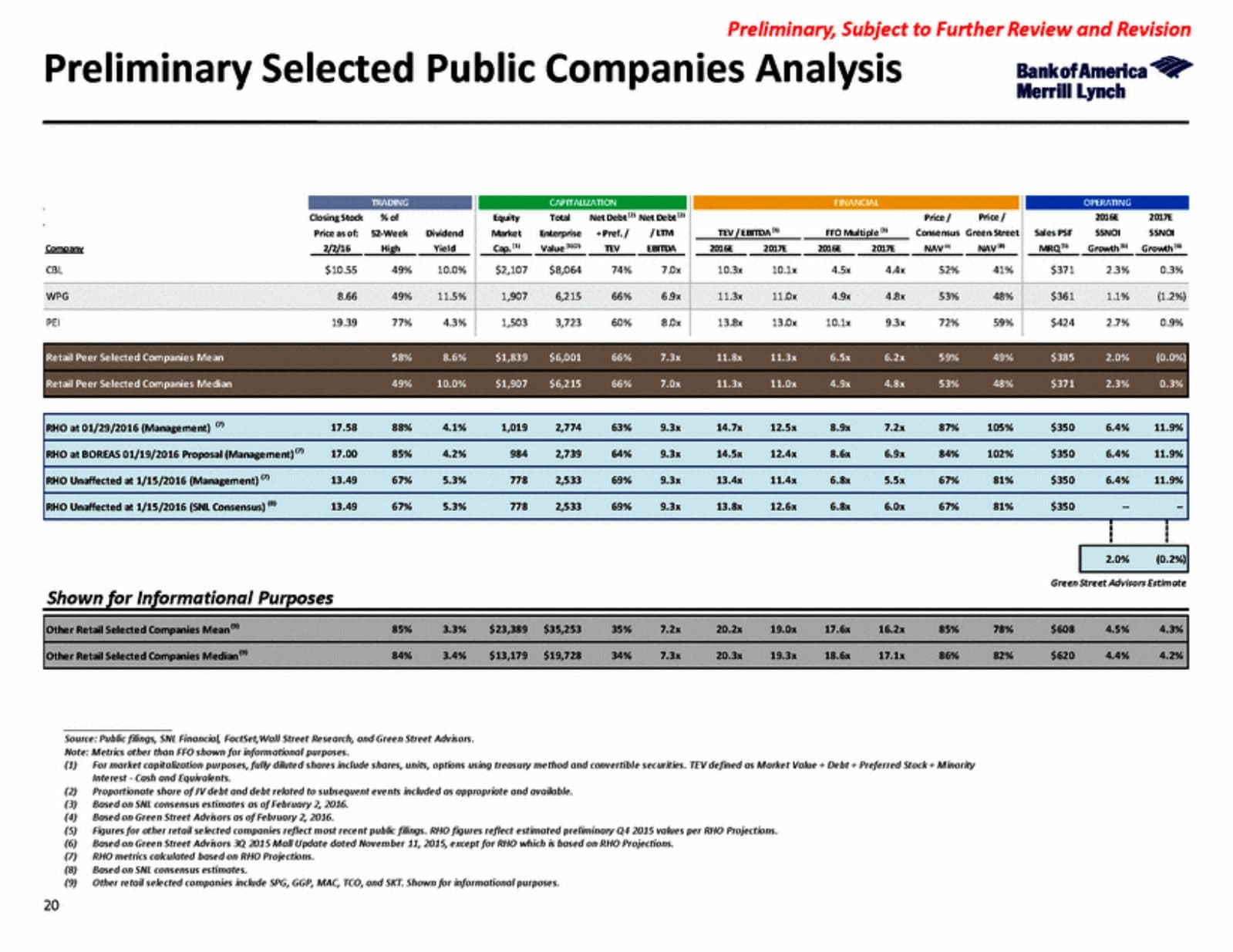
The "Preliminary Financial Analyses Summary" page, the classic football field chart stacking 52-week range, Wall Street research NAV estimates, precedent transactions, NAV, DCF, and 2016E/2017E FFO against the current stock price, looks like the single most sophisticated page in the deck. It is genuinely useful and it is the page a board actually reads closely. But building it is combining outputs that were each calculated on their own separate tab in Excel, then pasting the low and high of each range into one chart. The individual DCF or NAV analysis behind it took real work to build once. Restating its output on this summary page is formatting.
Sensitivity tables: the model already exists
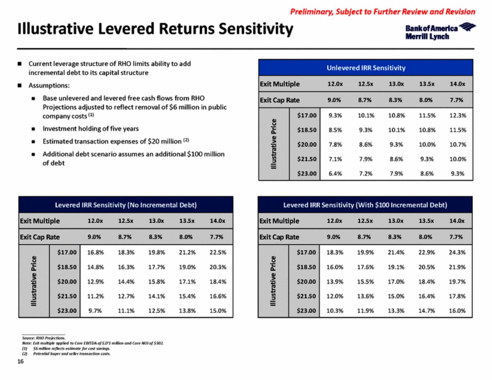
The levered and unlevered IRR sensitivity tables, showing returns across a grid of exit multiples and illustrative prices, look intimidating because there are so many numbers on the page. But a sensitivity table is what happens when you take a model that already works and let Excel's data table function recalculate it across a range of two input variables. You are not building five different models. You are building one model correctly, then letting the spreadsheet do the grid for you. Once the base case works, the sensitivity table is close to automatic.
| What the page looks like | What it actually required |
|---|---|
| Market update chart grid | Pull two market charts, format a table of arrows off numbers you already have |
| Trading volume overview | A FactSet export and a pivot table |
| Multi-year projections summary | Arithmetic on numbers management or a senior banker already gave you |
| Football field / financial analyses summary | Paste the high/low from six analyses you (or someone else) already built separately |
| IRR sensitivity grid | A working base-case model, run through Excel’s built-in data table function |
| Decision tree | Turning a VP’s scribbled napkin sketch or a short email into a structured slide |
| Process timeline | Moving colored bars across a calendar grid |
| Precedent transaction case study pages | Already built in a prior deal, reused and relabeled for credibility |
The decision tree: turning someone else's napkin sketch into a slide
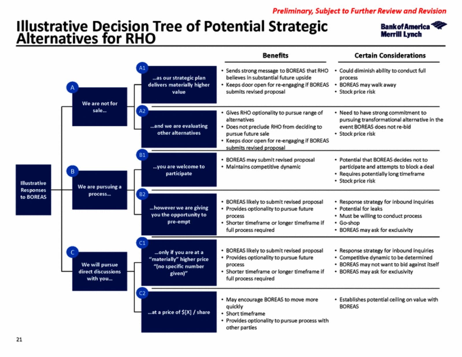
This one surprised me the most before I started. A page like "Illustrative Decision Tree of Potential Strategic Alternatives," mapping out branching responses to a bid with benefits and considerations for each path, looks like it required serious strategic thinking on your part. Usually it didn't. An associate or VP will tell you how it should be structured, sometimes literally a photo of a scribble on a whiteboard, sometimes a short email describing the logic, and your job is turning their idea into structured, labeled boxes with clean bullet points underneath. That's not modeling and it's barely analysis. It's taking someone else's thinking and putting it into a format a board can read in ten seconds.
The process timeline: moving bars on a calendar
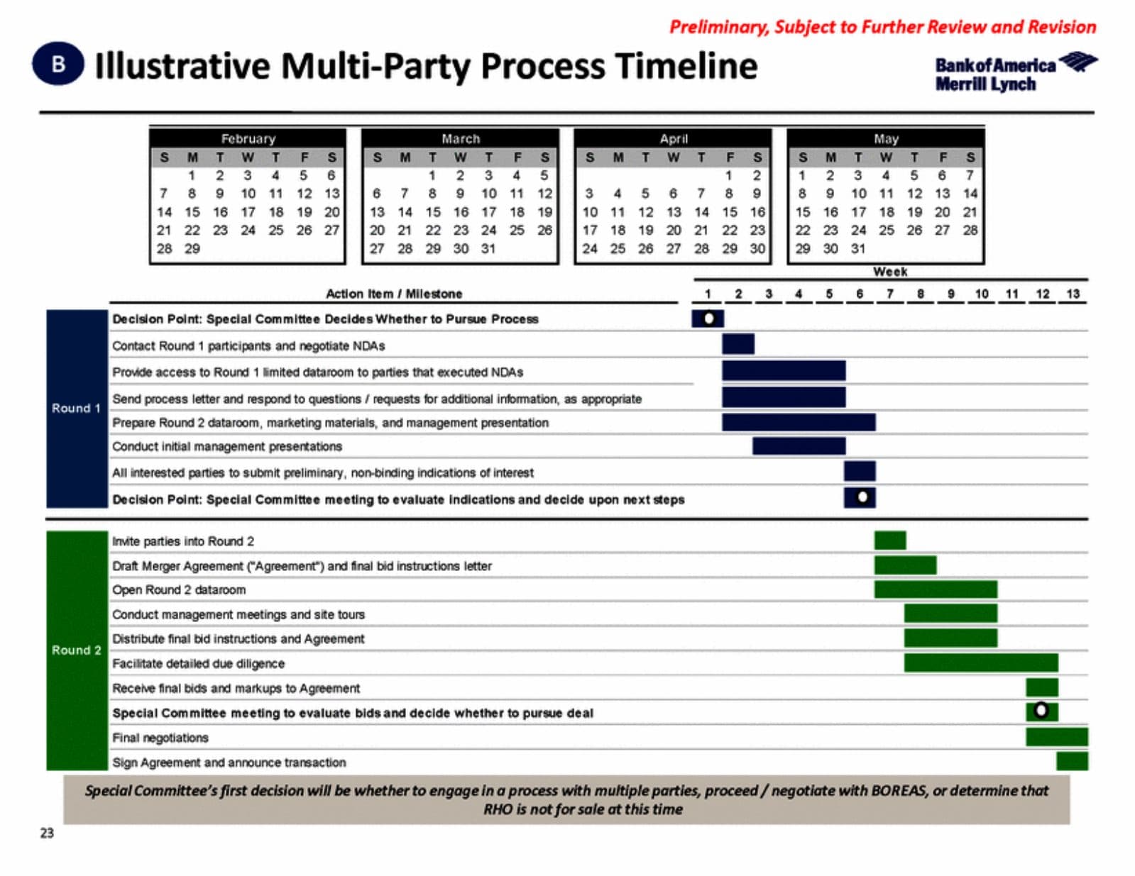
A page showing a multi-party sale process across a calendar, with colored bars marking "Round 1," "Round 2," NDA negotiation, dataroom access, management presentations, is genuinely one of the easiest pages in any deck to build once you understand the milestones. It's a Gantt chart. You are moving the position and length of bars against a calendar grid. The hard part, deciding what the actual timeline should be, was decided by the deal team lead, not you.
The precedent case study pages: already built, just slotted in
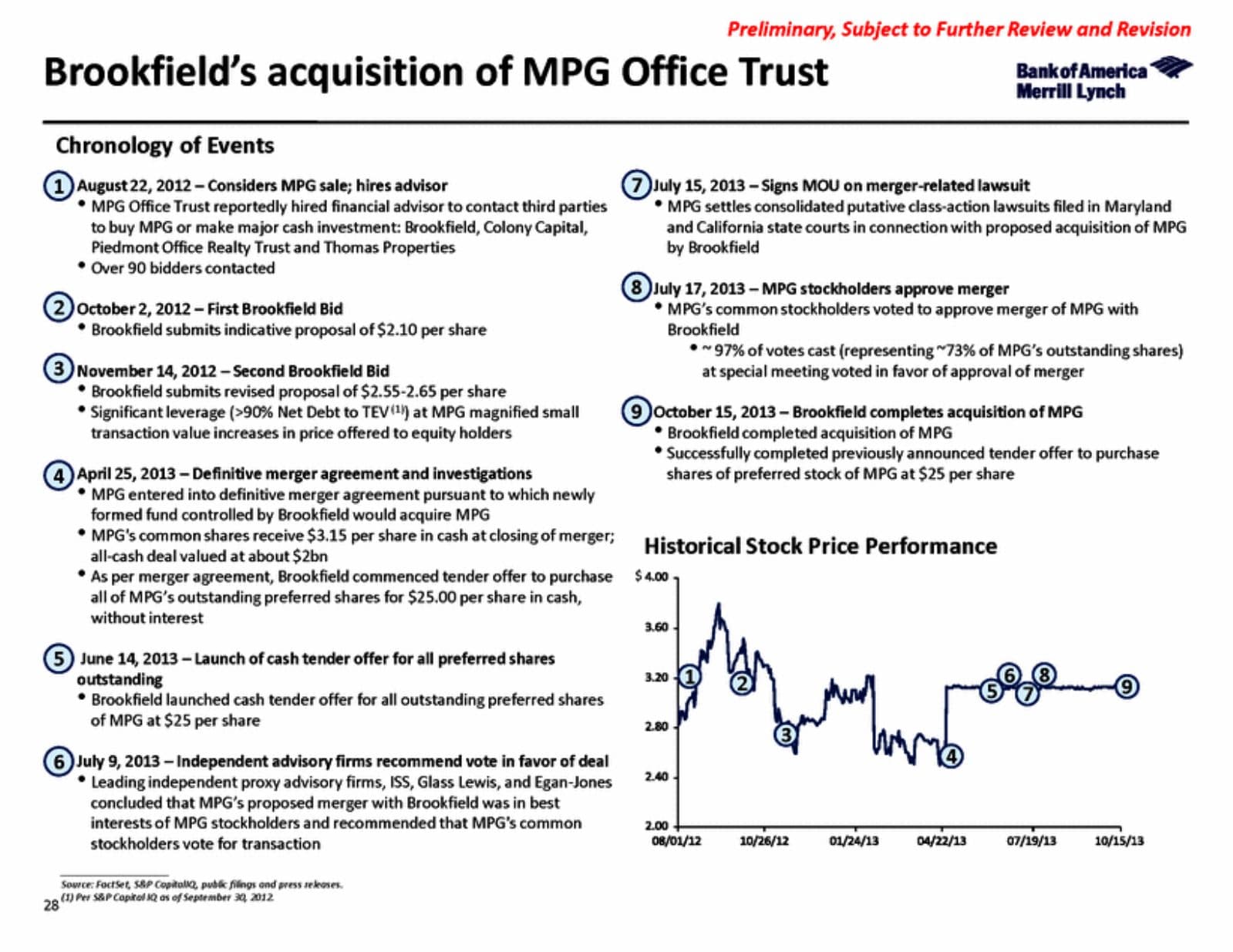
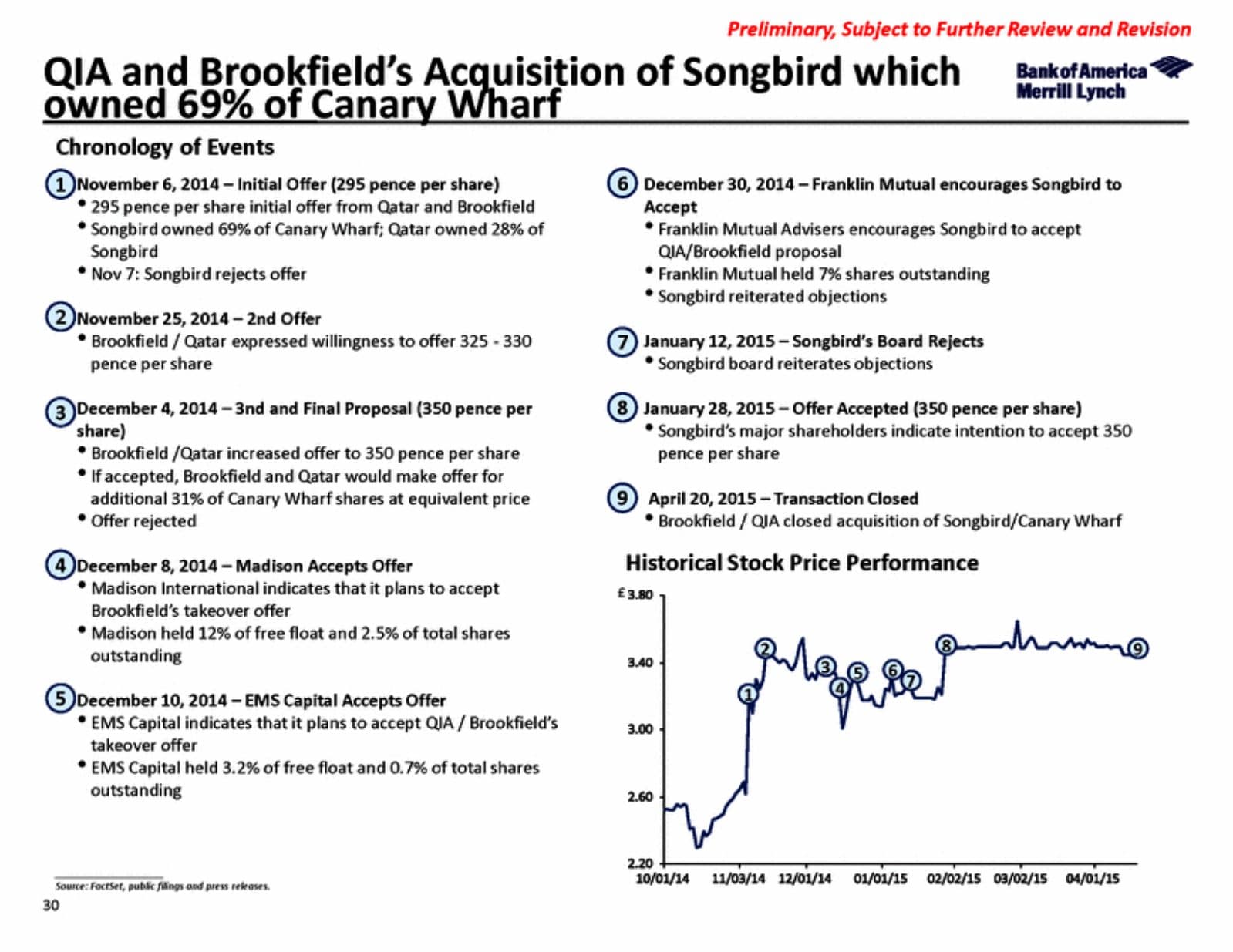
The deck above includes multiple full case-study pages walking through prior real estate M&A situations, each with a numbered chronology of events and a stock price chart. I remember thinking pages like this were uniquely annoying to build under deadline pressure. Then I found out most of the time they already exist. Banks maintain internal libraries of precedent case studies from prior deals, and a page like this frequently gets pulled from an old deck, updated with fresh data, and slotted in for credibility. There's nothing dishonest about that, precedent is precedent whether you built the page yesterday or eighteen months ago, but it's a good example of how much less "from scratch" work this job actually involves than it looks like from the outside.
What the real work actually is
None of this means the job is easy. It means the difficulty is somewhere other than where the fear points. The real skill is listening carefully to instructions and translating them accurately into structured slides and models under real time pressure, sometimes with almost no direction at all. I've had to build an entire presentation from nothing with no guidance, and I've had to update a slide mid-conversation while sitting across from a client. That happens regularly. The genuine learning curve is speed, judgment about what a senior person actually wants when they give you a vague instruction, and stamina, not raw technical difficulty.
By month two, most analysts can build these pages from a completely blank file. The first month, you're working off templates almost the entire time, because templates exist for almost everything: DCFs, comps, precedent transactions, sensitivity tables, football fields. You are essentially never inventing the analytical structure yourself when you start. You're filling in a structure someone else already built and proved out.
Who actually struggles, honestly
I've been a top-bucket employee in this seat, and I'll say plainly: it isn't for everyone, and some genuinely capable people burn out and leave. But in my experience that almost never traces back to someone not being smart enough for the technical content. It traces back to the hours, the unpredictability, and the mismatch between what someone actually wants from their life and what the job demands of it, which is a completely different question from whether you're capable of doing the work. A mid-bucket performer with genuine stamina for the hours will survive and often thrive. A brilliant person who hates the lifestyle will not, no matter how easily they pick up a DCF.
If you want the honest, specific version of what burns people out and what doesn't, I wrote about it directly in what to actually do if you are burned out in investment banking, and the deeper case for why the job isn't the elite-only career people assume it is in the investment banking prestige myth.
What to actually do with this
If the thing stopping you from applying, or from taking an offer you already have, is a fear that you won't be smart enough or that everyone else already knows how to build this, that fear is misdirected. You will be handed templates. You will be told what to build. The genuine test is whether you can execute quickly and accurately under real pressure once someone points you in a direction, not whether you can invent a valuation methodology from first principles on day one.
If you want to see what the finished product of that process actually looks like in the real world, not a teaching example but an actual board deck used to negotiate an actual deal, our case study library walks through more than two dozen of them page by page, sourced directly from SEC filings, including the DryShips/Evercore fairness opinion and the Rouse/Brookfield REIT going-private deal referenced above.
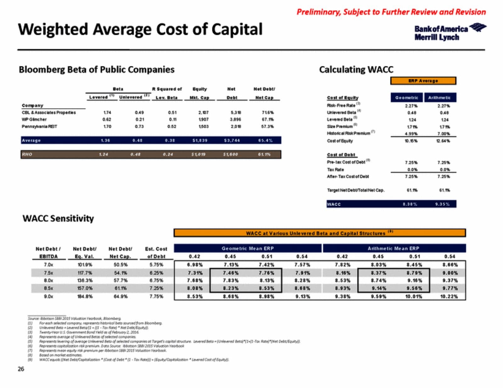
Every slide in this piece is a real page from the BofA Merrill Lynch presentation filed as Exhibit (c)(3) to Rouse Properties, Inc.'s Schedule 13E-3/A (CIK 0001528558), publicly available on SEC EDGAR. Personal accounts of working as an analyst reflect my own experience at Goldman Sachs and Wells Fargo Securities. This article is for informational purposes only and does not constitute career or financial advice.
Keep reading
Want this applied to your situation?
If the thing actually stopping you is fear rather than a real skills gap, a session can help you figure out which one you're dealing with.